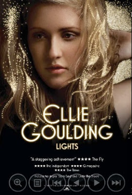
Ellie Goulding is
wearing a simple black top which fades into the background and emphasizes the
lighting. Her name is clear in luminous font, which matches the album name of
lights. Underneath is the name of the album and reviews at the bottom, this is
conventional of magazine adverts and is simple to follow
as it clearly shows the artist and the album, this is similar to Jessie j’s
album advert as both show the artist and the name of the artist clearly. The
reviews have come from magazines and may be smaller as the magazines may not
have recognizable names. Goulding's
pose represents her being laid back, indicating the genre of the music to be
calming. The font has a Gatsby feel and could represent that the album has a
classy, sophisticated
feel to it this also could have been used as it was around the time of the Gatsby film
coming out which would have increased its audience. The neon lighting helps
the advert to be bold, the colours contrast as it is light on dark and make the
font look almost 3-D. The album cover is the same, apart from the reviews at the bottom, this links
the products together, also Goulding being on the cover will help her brand
as she becomes recognizable and people will start to know who she is. Also, the sparkly
lighting in her hair and background represents that the music could have a pop feel
as pop is associated with the look and bright colours.
Jessie J is wearing black lace which suggests she is rebellious which could indicate
that on the album the music is rocky and alternative. Her name is in gold
writing which suggests she is royal and important. Also, the font has a gloss to it making it look 3-D, the album name is almost
unclear, but matches the picture as Jessie is expressing who she is. Jessie’s
pose indicates that she is confident suggesting that the music is going to be
edgy with a bit of attitude. The album cover is the same, so the audience will
associate these two images. Jessie’s make up is also heavy and expressive
giving off an attitudey vibe and indicating that the target audience is teenagers as they are
associated with being rebellious and different. The songs are mentioned on the
front as they are singles and the audience could recognize a song name and want
to buy the album because they like the song.
This
magazine advert is rather simple, suggesting that this band is all about the
music and doesn’t need extravagant make overs to advertise their music, this
type of advertising also gives an insight into the genre of music as it doesn’t
conform to the average advert, suggesting that the music would be rock or
alternative. The font of the band is in a slanted, cartoony font which could
suggest that their music has a similar feel. The album cover is the same which
makes this image recognizable, giving the band a brand. The heart monitor like
symbol could represent how the beat in the music correlates with a heartbeat
and how music makes you feel alive. Also the white on black makes the advert
very clear so it is easy to consume as an audience also there is a harsh contrast of the colours, which catches the readers eye.


No comments:
Post a Comment